Wednesday, June 30, 2010

Wedding Wednesday!!

Update #2: I'm taking down this week's poll because it's going crazy and I don't know how to fix it.  So if you'd like to vote (please do) just leave me a comment!

Update: Apparently this week's poll isn't working for some people... If you want, you can vote by leaving your choice in the comment section at the bottom.  Thanks for the heads up Patrice! :)

Welcome back to Wedding Wednesday!  So glad to have you this week!  We're down to the less-than-a-year mark finally, so now it's time to get going!  I know that a year seems like all the time in the world, but if there is one thing I've learned it is that things come up.  So I'd rather get it done and relax than put it off and stress.  (If only my philosophy about school work was the same... sigh)  So I was thinking about table cloths this week and realized I needed to see how many tables I needed before I could decide how many table cloths to get.  That launched a task that was way too anal retentive, even for me - a floor plan.  The reception venue included a floor plan in the package they gave us - complete with dimensions, table sizes, and scale... you can tell they've done this a time or two.  I know that 10 people can sit at a table, so I need about 20 tables.  I also need a place for the DJ, a dance floor, finger food, and gift/guestbook/favors.  So I created a floor plan (or three). 

Option 1:  Option one has the DJ on stage, the cake by the kitchen door, and a clear area for dancing.  When we talked with our DJ, who has done the Shrine Club before, he said he prefers being on ground level (as in, not on the stage) because its easier to interact with the dance floor.  So there's that issue.  And, I'm not sure I like alienating the guests who sit on the far right side of the room...

----------------------------------------------
Option 2:  I like option two a lot because there is a clear, huge dance area.  Also, when guests walk in, they'll see the cake and the finger food (to eat while we're taking pictures).  Tables are by the DJ, but they are the reserved tables (for the wedding party) who will hopefully be up and dancing/mingling anyways.  There is room to get in/out of the kitchen door so the servers will not be crowded. However, the favors/gifts/guestbook table is hidden against the back wall... :-\

---------------------------------------
Option 3:  Option three is cool because the DJ is not on the stage, the guests see the cake, reserved tables, etc. when they enter, and there is a open middle area for the dance floor.  The kitchen door is also not crowded.  However, the finger food is hidden against the back wall and the DJ is really close to the tables.

What do you think?  Which one do you like best - vote in this week's poll! I need your help! :) Then, once you help me with that, could you tell me what you think about table cloth colors?  Here's the thing - there are white walls, white floors, white chair covers, brown metal chairs... I mean its very plain.  You can refresh your memory here.  I'm a bit concerned about adding white table cloths to the mix.  I'm thinking mix of black, white, and blue.  I don't want to spend a ton of money on table cloths though, so I was thinking about using only a few fancy blue ones and the rest plain black and white.  I am so open to changing my mind though - so what are your ideas??

Also, does anyone know where to find inexpensive 120" round table cloths??  That would be helpful too!

As for last week's poll results, I was SHOCKED.  STUNNED.  Artificial bouquets won overwhelmingly against real bouquets. 15-6.  Ok, maybe that's not overwhelming, but wow.  I concur.  ;)

Up next week, see how my bridesmaid bouquets turned out.  Yes, I already did 3 out of the 5 of them.  Can't wait to show you!

Don't forget to vote on a floor plan.

P.S.  In case you thought designing a floor plan is anal retentive... apparently more people are like me than I thought.  See this: Google Images.   Well that makes me feel better.  :)
laura ann

Sunday, June 27, 2010

How Great Is Our God

This morning, our pastor shared a video clip from a message given by Louie Giglio.  In all seriousness and honesty - it has changed and rejuvenated my faith.  Please, please, please, take the time to watch it.  It's long, but every second is worth it.  I just have to share it with you, its on my heart so heavy.  It is entertaining, funny, but more than anything, so moving.  It will touch your heart!  I was going to give a summary, but Louie says it so well, I would never be able to give it justice.  Please watch it.


Click here to see the following parts:
Part 2
Part 3
Part 4
Part 5
laura ann

Thursday, June 24, 2010

Blog Design Tutorial Part 2

After you've created your own blog background (you can find the tutorial here), you can create an awesome header to go with it.  It's really simple, particularly if you've already familiarized yourself with Photoshop or GIMP.  As promised, I wrote a semi-tutorial on how to do it.  So let's get started!

I'll use GIMP because its what I'm most familiar with, although there are tons of tutorials on the web for Photoshop

Create a new document in GIMP.  If you're content area is white, then make the background white.  Otherwse, make it transparent.  Size is up to you.  You don't want to go much wider than 660 or taller than 500 (especially if you have the standard size content area).  My current header is 660 x 500 with a wide content area.  I think my next header wil be shorter, but thats just me.

The idea is to start with the bottom layer and build up - just like you would do if it was paper in front of you. 

I'm doing a blog design for my friend Brittany, so lets just go with that as an example.  Think about your favorite colors and things that make you happy.  For instance, I know that Brittany loves pink, black, and lime green.  She likes gerber daisies and polka dots.  With this in mind, I started with a pink polka dot background.
You can change the size by using the crop tool.* Just make sure you select "Current layer only" before you crop or else your whole header will crop.

Then I decided to tie in the blog background with a strip of the same design.  I also added some cute ribbon folds that I downloaded Shabby Princess.  You have to be careful what you download from there - they have some really great stuff, but the copyright on some of it won't allow you to use it on blogs, so just be mindful of what you download.  You could easily create your own by scanning them into your computer and touching them up in a program like GIMP.
Now we need to add the title - I mean what is the purpose of the header other than looking cute and introducing your blog?  So I added a place to put the header (a tag I also got at Shabby Princess).  You can fancy it up by using a clip, tack, or some other accent.  I found this clip in a download from Amanda's blog.  I also added a gerber daisy, just for kicks and giggles.

Then add the title.  You can use the text tool to do this - its easy to resize, recolor, change the font, etc.  Taa daa!

Now that's cute and all, but I wanted to add a little somethin' somethin', so I added the green swirly things (from Shabby Princess again).
Use your move tool and crop tool to adjust the location and size of layers.  You can also move the layers above or below other layers using the Layers, Channels, Paths window (usually on the right side of the screen).

**Other fun tools you can use: 
The Color Picker tool - after selecting this tool you can click on a color in a layer and it will hold it in your color history.  Then you can use the same color on your font or shapes.  For example, I color picked the dark pink on the bottom layer and used it on the title words.  This way your colors all match precisely.
The Crop tool - like I said, this can either crop you're entire document or just your layers.  Make sure "Current Layer Only" is selected if you want to crop just the active layer.
The Text tool - this allows you to write text on your document.  For this header, I created three text boxes - one for "As told by," one for "-B-," and one for "A blog by Brittany."  Having separate text boxes allows you to use different fonts and sizes of fonts for different words and lines of words.

Another awesome thing to play with is color.  Say that you found a design that you love but it isn't the right color.  No problem!  Open it in GIMP and go to Colors > Colorize.  Play around with it until you get the exact color/shade you want.  Then you can use it - no problem.  In fact, you wouldn't know it but the green swirly things in Brittany's header were actually gray.  And the green clip was actually black and white... (like the one in my header).  And the gray tag was off-white.  You can use any pattern/embellishment you like if you can colorize it to the right color!

Okay.  Once you've got it like you want it - save it as a .xcf (so you can go back and change it if you want), and then save it as a .jpg (so you can upload it onto your blog).

Then go to your blogspot dashboard and click on "Design."  Under the "Page Elements" tab you should see a storyboard layout of your blog.  At the top is a box for "Header."  Click edit.  A window will pop up and you should uncheck "Shrink to fit" (you don't want your awesome design to shrink!) and check "Instead of title and description."  Then upload the .jpg file from your computer.  Save and check out your awesome blog header!

If you have an awkward border around it (I hate that thing), you are not to worry.  Go back to "Design," but this time go to "Edit HTML."  Scroll down to the header section and find this:
#header-wrapper {
width:1000px;
margin:0 auto 10px;
border:1px solid $bordercolor;
}

Change it so it says this:
#header-wrapper {

width:1000px;
margin:0 auto 10px;
border:0px solid $bordercolor;
}

Then go down a bit and find this:
#header {

margin: 5px;
border: 1px solid $bordercolor;
text-align: center;
color:$pagetitlecolor;
}

Change it to this:
#header {

margin: 5px;
border: 0px solid $bordercolor;
text-align: center;
color:$pagetitlecolor;
}


That should take care of the awkward border around your header.  You can do the same thing for borders around pictures in your post by looking further down in the HTML code at the IMG in the Post section.

Another option is changing the border color.  If you don't want to change the px strength (size?), you can change the color of the border to white.  To do this replace "$bordercolor" with "#FFFFFF".  Do it for both #header-wrapper and #header.

Let me know if you have questions! I know a lot of that was pretty vague, but if you've already done the background, you'll pick it up fast!  Next tutorial will be on post signatures!
laura ann

Wednesday, June 23, 2010

Bouquets - Fake or Real?


Welcome to Wedding Wednesday!  More like, Welcome to Wedding Wednesday Night!  Haha!  It might be a bit late, but this week we have a great topic - Real vs. Fake flowers! Du du dummmm :)

Let's have a bit of a warm up shall we?  Which of the following bouquets is fake?

Can you tell?  Trick question - they're all fake.  I know, I know, I'm SO corny.  You know you love me.  And I love you too of course!  :)

I've chosen to make my own bouquets using artificial flowers.  I know that there's such a stigma attached to fake flowers, even I turn up my nose to them sometimes... but after lots of consideration, the decision has been made.  The DIY in me, the price, and the idea of keeping it forever won me over.
See? I told you there was a lot of consideration!  I've heard of people DIY (DIYing?) real flowers, but let's be honest - do I really want to spend the day before my wedding making real bouquets?  Nope.  :)  Has anyone had experience DIY artificial bouquets?  I've played around in Michaels and I have a general idea of what I want, but I'd love to hear your tips!  Anyone want to help?  We can make a party of it.  :)

Last week I asked, "What location would you choose for your wedding??" The poll results are in - Inside wedding at a church (18 votes), Outside wedding on the water (3 votes), Outside wedding somewhere besides the water (2 votes), and Inside wedding somewhere besides a church (1 vote).  Yay for a great turnout again!  Thanks to all who participated!

This week you can give your input on fake vs. real flowers.  Which would you do?

Until next time,
laura ann

Monday, June 21, 2010

Happy Summer!

Happy first day of summer!
Looks like I'm going to have a great time walking to class this week!  Yay grad school.

Oh yeah, and Happy Monday!
laura ann

Wednesday, June 16, 2010

Outside Weddings


This past weekend, Parker and I went to a Wedding Reception/Party for some close friends of ours, Charlotte & Jeff.  They had the right idea and went to some gorgeous beach and got hitched, came back and threw a party.  Why didn't we think of that?

The party was awesome.  It was at this cool boat house and it was gorgeous.  The DJ was great, the food was great, everything was just wonderful!  Well, except this mini-hurricane came and about blew us away.  Seriously.  The umbrella's went flying and all the men had to get tough and take them down.  Some of the food flew across the deck... not fun.  But in a way, very fun and memorable.

That picture is from their wedding.  Its absolutely gorgeous.  So jealous.

My best friend's sister got married outside in her parents' backyard a few years ago. It was the prettiest wedding I've ever been to.  The ceremony was under this big ol' tree and then we walked over to the other side of the house and had the reception.  It was the perfect set up.

I also went to my cousin Melissa's wedding in Historic Bath.  I think it was at Bonner's Point (??)  Anyways, it was gorgeous.  The weather was good, the setup was nice, and she looked beautiful.  I bet Parker & I have said 100x "Why didn't we think of this?"  Seriously, we thought about changing our mind for about 1 minute when we remembered we already put the deposit down for the reception.

So the point is... I'm in love with outside weddings.  Yet, I'm having mine inside?  Yeah, yeah... ::shakes head:: Oh well.  I'm thinking inside wedding with outside pictures maybe?  So this week's poll question is: Which do you prefer: Inside or Outside weddings?

Last week's poll had an awesome turnout - 16 votes for the bride to enter with "Here comes the bride" and 8 votes for something else.

laura ann

Tuesday, June 15, 2010

Our Kitchen!

At long last, the wallpaper is down, the walls spackled, and all is primed and painted.  Remember the horrid red textured wallpaper and dark stained cabinets?

Well, they were replaced by light and airy...

Hooray!  What do you think?


We will eventually replace the cabinet pulls and hinges with a silver-colored finish.  In fact, we already have new pulls, but we can't find hinges like the ones we have (they mount on the inside of the cabinet)... so that's on hold for now.


I don't know which I love more - the new look or Parker washing dishes... HA!  Just kidding.


Please excuse the Pepsi can and the missing door pulls (they're at my parent's house getting cleaned).


We have to do a little touching up here and there, but whew!  What a difference!  And I love it!
laura ann

Wednesday, June 9, 2010

Ceremony Music Part II


Welcome back to Wedding Wednesday (after a mini-break last week).  This week's topic, upon request, is in regards to ceremony music.  Now I know that we've already talked about it once before, but this time the focus is on prelude, processional, recessional, and postlude music.  Because our wedding is in a church, our music will be more traditional, so naturally, the following songs are more classical and religious than contemporary and secular (sorry if you were looking for the latter). 

Note:  If you're like me, song titles and artists mean next to nothing.  I have to hear the song over and over before I decide if I like it.  So, for you're listening pleasure, I have a playlist at the bottom of this post that includes most of the songs that I mention, in the order that they appear.

For prelude & postlude music, we'll let the pianist make the decisions based on her experience.  It should be something light and easy for guests to listen to while they wait for things to get started.  From what I've experienced, prelude music usually starts about 30 minutes before the ceremony begins and postlude music plays until all the guests have exited.

During the processional music, we'll have the Seating of the Grandparents, Seating of the Mothers, Wedding Party, and Bridal March.  Since the only grandparents we have living are my paternal grandmother and maternal grandfather, I'm wondering if we should just have one song played for the Seating of the Grandparents and Seating of the Mothers, rather than having two separate songs.  What do you think? 

For the Wedding Party, I want something that matches the previous song's style, but is distinct enough to mark the entrance of the groomsmen and bridesmaids.  For the Bridal Processional, we'll be sticking with the traditional Bridal March (you know, "here comes the bride..."), although I know a bunch of people who chose something else that was just as wonderful.

Some nice traditional choices for the prelude or processional music are Jesu Joy of Man's Desiring, Arioso, Canon in D, Trumpet Voluntary, Sonata in G Major, and Spring from the Four Seasons.  Other classic choices that aren't as traditional include Be Thou My Vision, How Beautiful, In Christ Alone, and The Bridal Prayer, all of which could be performed vocally.

As far as recessional music, I recommend something joyful!  Part of me wants to play the Hallelujah Chorus (that's how we'll feel at that moment!), but some other great choices are Joyful, Joyful, We Adore Thee, Immortal, Invisible, God Only Wise, Water Music Hornpipe/Allegro Maestoso, and The Wedding March.

If you're looking for more of a contemporary feel, I like Charlie Hall's version of Joyful, Joyful, We Adore Thee.  Remember that the instrumentation can really change the sound of a song - Do you like the organ?  Piano?  Strings?  Trumpet?  Soloist?  A combo?  It can make all the difference!  Also, if you're wedding is outside you're going to have some limitations - no organ or piano, but maybe a keyboard or recording?  A guitar?  If you don't like the song, try it with a different instrument.  I love the idea of a soloist during the processional, and I'm not a big fan of the organ, but I love the sound of the piano.  Pick what fits your style and the tone you want to set for the occassion.  That's what's important - 10 years from now you won't remember which song you used for what, so just go with your instinct!  :)

Just for fun, this week's question is "Do you prefer the traditional Bridal March, or something different?"

The last poll results showed that out of four invitation choices, 53% of the voters prefer Option 1, 20% prefer Option 2, 0% prefer Option 3, and 26% prefer Option 4. My favorite is Option 2... if it only came in blue...  :)


Get a playlist! Standalone player Get Ringtones

Thanks for stopping by & jammin' out to ceremony music! Haha, you know you loved it.
laura ann

Tuesday, June 8, 2010

Random Rambles No. 2

Great news! Mom's most recent scans of her chest, abdomen, and pelvic regions showed no sign of cancer!  The spots on her brain are still there, but unchanged despite going untreated for several months.  We are very pleased and thankful!  The doctor found that she has a deficiency in Vitamin D which has caused her to experience fatigue, weakness, and muscle soreness.  She wrote her a prescription for a high dose of Vitamin D and said she should notice a huge difference soon.  We are so excited and relieved to hear this great report.

In other news, Parker & I have decided that the next home we buy will have the cabinets already painted or else we'll hire someone else to paint them... because I'm. Never. Painting. Cabinets. Again. Ever.  We both work 40 hours a week, so we've been painting in the evenings (the ones that don't have baseball or church softball games) and I'm so ready for it to be DONE.  It took a week to get wallpaper down, a week to fix the sheetrock/sand everything, a week to prime/paint the walls, and like 4,252,352 weeks to paint the cabinets.  Okay, maybe not that long.  (Don't forget the leak we encountered!)  We have the cabinets primed and painted, but now we've got to prime and paint the doors/drawers and touch up the cabinets in a few areas.  I can't wait to show you pictures of this tiny kitchen that is consuming our life :)

Have you ever seen the show "Renovation Realities?"  Boy, we could be on that show.  We'd make good TV I bet.

Speaking of TV, I'm going to need Grey's Anatomy to come back on.  Seriously.  It's so good.  I'm a new "Grey's" fan... I just started watching it this season (after like 9 seasons of being on air or something??!!), and I can totally see what the fuss is all about.  So. Good.

Mm k.  That's all for now.
laura ann

Sunday, June 6, 2010

Blog Design Tutorial Part I

Creating your own blog design can be a quick and easy task... but it can also be daunting and complicated.  However, you are not to worry because I've already gone through the trial and error of it all, and here it is in all its amateur glory for you to use if you wish!

First you need to use an image editting program like Photoshop or GIMP.  This tutorial uses GIMP because a) its what I use, b) its a free download, and c) there are many tutorials for Photoshop already on the web.  You can download GIMP here.

Then you need to pick a color scheme for your blog.  Do you like pink and green?  Yellow?  Blue?  Once you decide, you can do one of two things - find a background online that you can manipulate OR scan the actual hard copy of paper/fabric/etc. that you want to use and save it to your computer.  You could use scrapbook paper or a scarf or a drawing... whatever floats your boat.  :)  Amanda at Fonts for Peas has created some free downloads that are pretty awesome, and I'm sure you can find other sites that have some also.

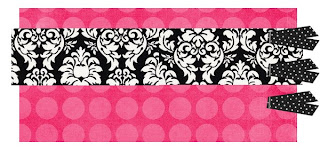
Once you find something you like, create a new document in GIMP by clicking File > New.  You will be prompted to choose an image size.  Make the width 1600 and the height 1100.  Expand Advanced Options and select Transparency as the Fill color.  It should look like this:

Then you'll need to set up guides to mark the margins.  If you want a standard content area (Blogger's default) make your guides at 400 and 1200.  If you want a wider content area (like mine, good for larger pictures), make your guides at 285 and 1315.  To do this, click Image > Guides > New Guide.  Make sure your guides are vertical, not horizontal.

If you can't see your guides, go to View > Show Guides.  While you're at it, make sure View > Snap to Guides is checked too.

Then you'll need to make a background for the content area.  Here's the thing - while you may choose to use a color, it is (in my opinion) best to use white.  This is because a) it's easier to read text with a white background, b) if you choose to make a signature for the end of your posts, white is the easiest to work with, and b) white matches just about all color schemes and themes.  So, to make the content area background, click Layer > New Layer.  It will prompt you to pick a size and fill color - it should be the same size as your document (1600 x 1100), but change the layer fill color to White.

Now, you should see a big white rectangle with guides evenly spaced from the left and right sides.  To make just the content area white, you'll need to crop the white rectangle so that it is confined within the guides.  To do this, select the crop tool and check Current Layer Only on the Toolbox window.  Like this:
 

Once you've done that, use the Crop Tool to select the white area between the guides.  (It shouldn't be hard to get exactly on the guides if you checked the Snap to Guides earlier.)  Click enter when it is selected to "cut"/crop it.  Your document should look like this:
There are other ways to do that, but that's the quickest and easiest in my opinion.

Now comes the fun part.  Go to File > Open.  Open the picture of the background you scanned/saved/downloaded.  When it opens, right click on it and go to Image > Scale Image. 

A screen will pop up and you should change the width to 1600. That should automatically change the height, but make sure the height is at least 1100 before clicking Scale. Then, copy the image (you can do Ctrl + C or Edit > Copy) and go to your main document and paste it (Ctrl + V or Edit > Paste).

At this point you may see all, a small part, or none of your image.  To make it a layer, go over to your Layers, Channels, Paths window and right click on "Floating Selection (Pasted Layer)" and click New Layer.
Then you'll need to move your pasted layer down so that the white content area is on top of the design.  You can do this by clicking the pasted layer and dragging it so that it is underneath the white block.  (So from top to bottom, it should read New Layer, Pasted Layer, Background)

It should look like this (with your background, not mine of course):

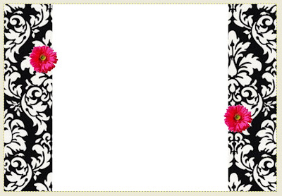
This is the most basic way to create a design.  Of course you can add embellishments and other layers by going through a similar process.  Just find the embellishment(s) you want to use, open it in GIMP, resize it if you wish, copy and paste it into the main document, and make it a new layer.  You can move it around  by using the Move Tool (up one and to the right four from the Crop Tool).  You can hover your mouse over a tool to see what it is.  For example, a fancier version of this blog design could look like this:

Once you get it like you want it,  it's time to save (if you haven't done so already).  Go to File > Save As.  You'll want to save it twice - once with the GIMP extension and once as a JPEG (or an other uploadable extension).  Save it as Background.xcf (This is so you can go back and change it using the layers if you want).  Then go to File > Save As and save it as Background.jpg (This is so you can upload it on the web).  It'll prompt you to flatten the image, click Export.  Then it'll prompt you to choose a quality.  Go with whatever it suggests (usually around 85-100) and click Save.

The final step is uploading it to your blog.  To do this you'll need an online host like Photobucket.  So go to Photobucket (or whatever you choose to use).  Before you upload, click More Options and select One Megabyte file size (this is so it'll cover the whole computer screen).  Once it uploads, copy the Direct Link.  It should be something like this (Except your username and file name):
http://i696.photobucket.com/albums/vv329/gracelikerain-laura-ann/Background-1.jpg

Okay, now go to your Blogger Dashboard and click the Layout tab.  Select Edit HTML.  In all that jumble, find where it says something like this, it should be towards the top:  
body {
background:$bgcolor;

Change it so it looks like this:
body {
background: url(PASTE YOUR DIRECT LINK HERE) no-repeat center fixed #FFFFFF;

For example, mine would say:
body {
background: url(http://i696.photobucket.com/albums/vv329/gracelikerain-laura-ann/Background-1.jpg) no-repeat center fixed #FFFFFF;

And taa-daa!  There's your new background.

----------

Some hiccups that you might encounter:

If your template wasn't Minima, the background might not display correctly.  To make it Minima, go to Layout > Pick New Template > Minima.

If you made your design with a wider content area like mine, but your HTML coding for the content area hasn't been changed from the default, you will need to change it.  To do this go to Layout > Edit HTML

Find this:
#header-wrapper {
width:660px;
margin:0 auto 10px;
border:1px solid $bordercolor;
}

And make the change in green:
#header-wrapper {
width:1000px;
margin:0 auto 10px;
border:1px solid $bordercolor;
}

Then find this:
#outer-wrapper {
width: 660px;
margin:0 auto;
padding:10px;
text-align:$startSide;
font: $bodyfont;
}

And make the change in green:
#outer-wrapper {
width: 1000px;
margin:0 auto;
padding:10px;
text-align:$startSide;
font: $bodyfont;
} 

Then, find this:
#main-wrapper {
width: 410px;
float: $startSide;
word-wrap: break-word; /* fix for long text breaking sidebar float in IE */
overflow: hidden; /* fix for long non-text content breaking IE sidebar float */
}

And make the change in green:
#main-wrapper {
width: 750px;
float: $startSide;
word-wrap: break-word; /* fix for long text breaking sidebar float in IE */
overflow: hidden; /* fix for long non-text content breaking IE sidebar float */
}

Finally, find this:
#footer {
width:660px;
clear:both;
margin:0 auto;
padding-top:15px;
line-height: 1.6em;
text-transform:uppercase;
letter-spacing:.1em;
text-align: center;
}

And make the change in green:
#footer {
width:1000px;
clear:both;
margin:0 auto;
padding-top:15px;
line-height: 1.6em;
text-transform:uppercase;
letter-spacing:.1em;
text-align: center;
}

Shew!  Did you get all that?  Well it's all I have for you now.  Blog Design Tutorial Part II will come eventually soon and will be about designing headers and post signatures.  Is there anything else y'all would like to learn how to do?
laura ann